When it comes to effective marketing, visual appeal counts a great deal. From well-known companies to more independent businesses, having a product that draws you in for a closer look is the first step towards getting a purchase.
The same can be said for your typical candy products. Some candy packaging ideas are quirky and outlandish, while others are more ordinary in their approach. If you are looking to customize your candy boxes and packaging in a specific way, here are six sweet candy packaging ideas to use for these treats.
1. Sophisticated Candy Packaging
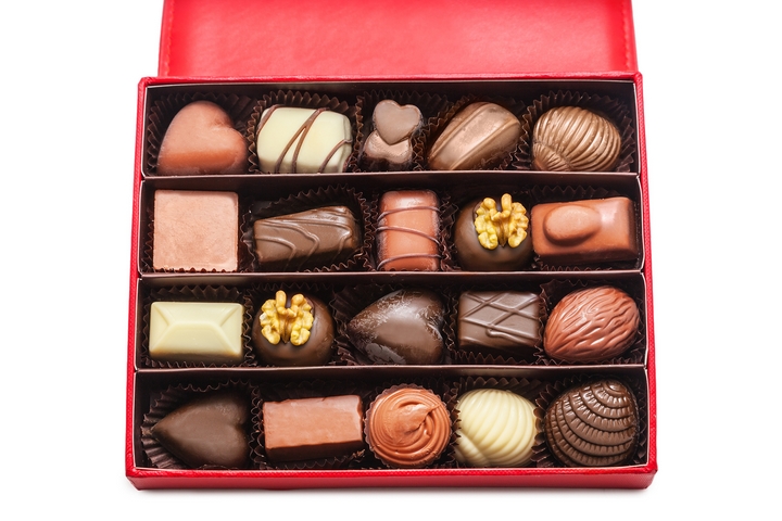
Your candy packaging ideas should be simple yet elegant. Package your product as a luxury and deliver it in a way that makes your customers need it, not just want it. Some candy companies are famous for using this sophisticated approach.
Lindt, the famous Swiss chocolatier and confectionary company, capitalizes on this method for their products. Most of their delectable chocolate treats are packaged in a way that accentuates the gold in the design.
Whether it be the cursive style of the font, or the smart contrasting of the selected colors, candy or any sweets packaged in this way are sure to draw in customer eyes the same way a Rolex or Tesla effectively does.
2. Minimalist Candy Packaging
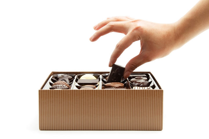
Minimalistic candy packaging ideas can do wonders. Initially, you may find any sort of product that has little to no visual appeal to be superficially boring. However, in today’s day and age, using minimalism correctly can sell something a thousand times better than a bunch of unsystematic words, pictures, and colors.
Similar to the sophisticated approach, using the right color such as a white or light gray provides the perfect aesthetic for a candy product. In addition, when complimented by a simple font and logo, an appealing impression is left by these packaged chocolate or candy bars.
Some espresso candied products come in packaged designs that are emulate this look. Although not too dissimilar to the approach used by Lindt, a minimalist approach in packaging has enough to differentiate itself for its own unique appearance.
3. Brightly Colored Candy Packaging
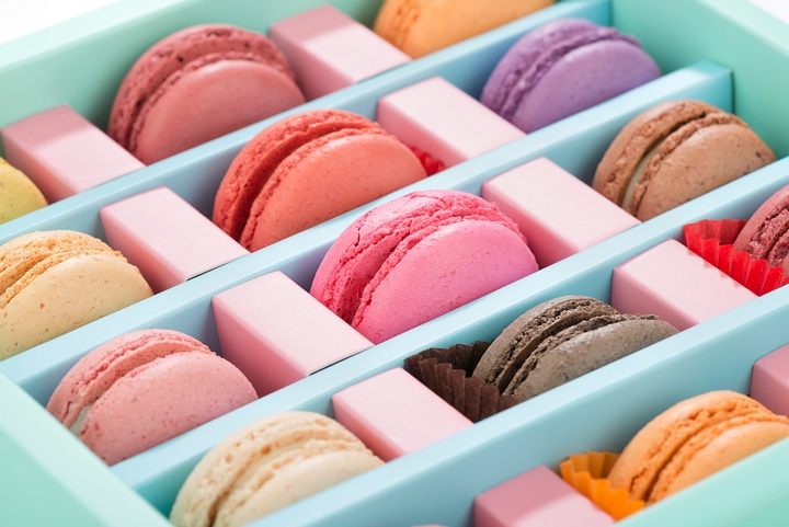
These brightly colored candy packaging ideas are usually the wrappers that caught your attention when you were an eight-year-old in a candy store. Candy products packaged in vibrant colors are usually done in a means to quickly reel in eyes to the respective product.
Nestle is just one of those large companies that make use of this to great effect. From Kit Kat bars to Coffee Crisp, primary colors are used as effectively as possible when complimented by a usually outlandishly-sized font.
Truthfully speaking, this specific type of candy packaging never loses its effect. Whether you are a kid accompanying your parents to the grocery store or an actual parent, you’ll always acknowledge these treats for their timeless visual appeal.
4. Bag And Label
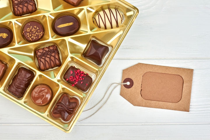
Sometimes, not having a specific type of look in mind can work out better depending on the goal. Whereas a minimalistic approach would see candy packaged in a way that is designed to appear cool, a modest cellophane bag would market your treats together just as well.
Simply place the candy inside and seal it with a label that can have the product’s name, company name, logo and nutrition facts printed on. On occasion, people aren’t really on the lookout for the marketability of their desired treats. They simply just need it for a future use.
In the case of packaging your candy this way, you’ll find that a bag and label is best suited for selling your treats in a bulk manner. Plus, it’ll keep your treats fresh if the bags chosen are resealable.
5. Artistic Candy Packaging
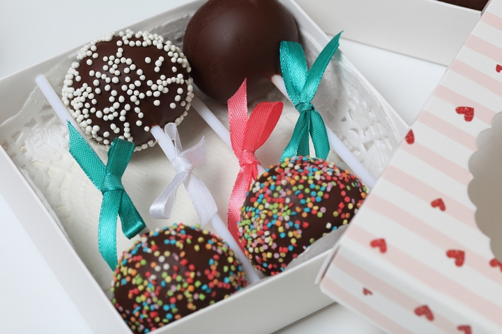
Certain companies will go out of their way to package their candy with lovely illustrations. This is a fantastic approach if you want to grab your customer’s attention with unique designs for each specific product.
Cacao 70 is one such company that markets each of their candy bars with eye-catching pictures. Some can be bright and lively, while others are more serene and calm. Some may even be designed in a way that tells a story, further accentuating the product’s marketability.
If you want to effectively sell your candy, use packaging that emits an emotional connection. Pictures and unique illustrations will resonate with your customers and will more than likely lead to a purchase in the end.
6. Special Occasion Wrapping
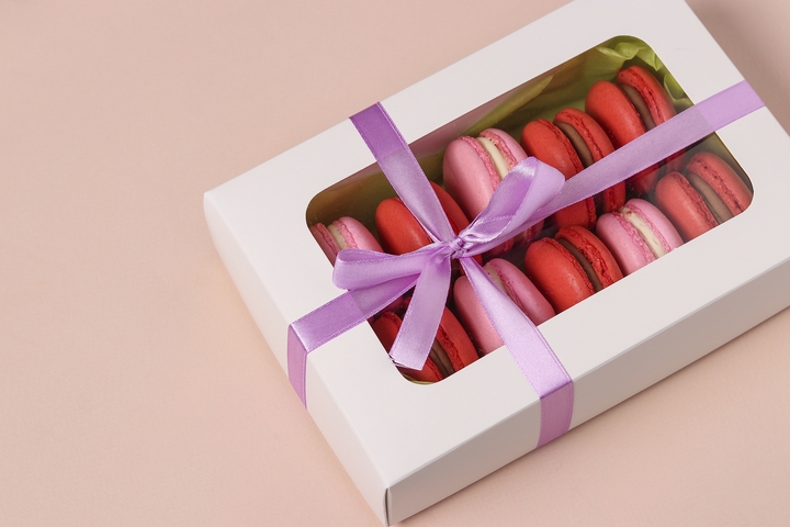
If your candy is getting ready to be sold to coincide with a special occasion or event, why not use packaging that reflects that? Many companies create limited edition types of candy or chocolate for Christmas or Halloween.
This is the perfect time to use colors, illustrations and fonts to mimic the spirit of those days. Christmas-themed candy, for example, will have red, green, and white for colors to deliver a comforting seasonal feel. Halloween, on the other hand, will use orange and black with cartoony fonts to emit a spooky-like sensation.
Holidays are the perfect time to put your imagination to use. The right packaging will whet your customer’s appetite for the delectable treat inside waiting to be devoured, no matter the time of year.
You’ll never find candy in short supply, no matter where you go. Instead, you’ll discover an abundance of assortment not only when it comes to type of candy, but in packaging as well. If you’re trying to sell your own, get inspired and start designing!
